Maximizing Conversion
through a Leaner Onboarding Journey for


HerCircle
User Research | UX & UI Design | Testing
How do I save users a minute of their lives?
In 2 weeks, our team of two redesigned the Hercircle sign-in flow—eliminating 10 clicks and reducing process time by 58.6% of its original duration—backed by data-driven research and user testing.
1.
Context
HerCircle is a platform for Indian women to connect and stay updated. It has multiple verticals pertaining to health, professional and personal growth and more.
With a reach of over 590M users, boasts an impressive rating of 4.8 for the app.
However, we dug into critical reviews and user surveys to find that the Onboarding Journey needed enhancement.


2.
How does it work now?
We designers rolled up our sleeves and set out to figure how it works now and how to enhance it from there.
The existing userflow looked like this.

UX Inspection through Heuristic Analysis and Cognitive Walkthrough of Existing Onboarding Journey
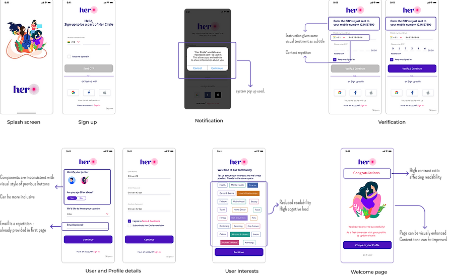
Insights
The analysis of the existing flow revealed
-
There are redundant data asked for, making the onboarding flow more time consuming. Revaluation of the input data is required
-
Visual inconsistencies of multiple components
-
Improvement that needs to be done for enhanced Accessibility and Readability
-
Pages with high cognitive load for user
3.
Benchmarking
Before moving to the solutions, I decided to take a look at the existing trends and standards in market, similar to HerCircle app as well as Apps known for the smoothest Onboarding Journeys.

Recommendations
Benchmarking of products for the Indian user landscape revealed
-
Use of SSO to make the journey quicker and easier.
-
Indicating number of steps in the process
-
Theme of the App and introduction to the diverse verticals can be provided.
-
Language selection can be added for inclusivity
-
Instant input validation needs to be included.
4.
Designing
From the Research and Analysis, the need to upgrade the Onboarding journey and the points of improvement were found. Now its time to create a solution from the insights we have.
Defining The
Strategy
UX
HerCircle stands out for its rich content and articles, already available on the website. The UX strategy focuses on quick access to HerCircle’s core content through the shortest user flow with minimal onboarding. User data can be collected progressively, as per requirement and gamification to encouraging profile completion over time.
Updated Userflow

-
Major update has been the removal of account creation steps: name, username, password
-
The account can be OTP verified, and the user can get to the App content quicker, thus increasing engagement.
-
More information can be prompted from the user later on, with app associated rewards
Updated
Design

-
Language selection is added for inclusivity
-
The static logo is replaced dynamic animation, introducing the verticals and app functionalities to a new user.
-
OTP Verification for sign in is given priority
-
Easy sign in through SSO
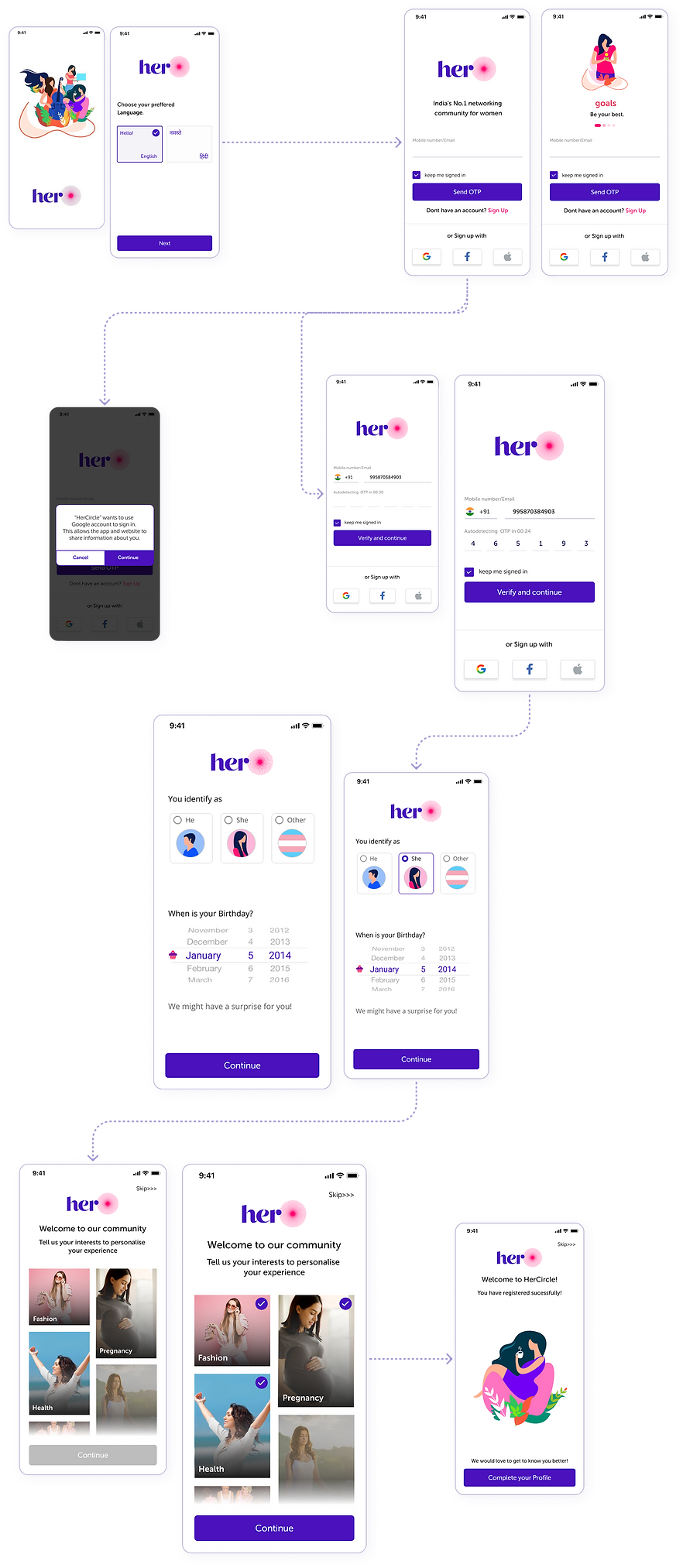
Re-designed Pop-ups
Automatic OTP Verification
Gender selection buttons redesigned for better UX
Birthday selection instead of age category for personalisation
Gender categories more inclusive
visual and content enhancement
Major update:
Interest selection changed to a Grid for easy context, and scan-ability
5.
Testing
The Updated Designs were tested against the previous Using Maze. A short survey and qualitative interview was included with this.
Users
28
18-50
Age Group
Users were asked to complete sign in process through both the designs, time taken and process success rate, page heat-maps were made. This was followed along with a 12-20mins long qualitative interview.
100%
Users preferred the updated design

User
Responses
Gender Selection

Before

After
100% user preference
This is a great improvement and its more inclusive. In the first design I did not understand they were buttons.
Agnes
31, Bangalore
Age Selection

Before
20% user preference

After
80% user preference
I liked first design since it's faster and easier. Also I don't see why date of birth is required here.
Padmasree
26, Kochi
I like the personalisation that asking of birthday gives.
Treasa
29, Bangalore
Interest Selection

Before

After
I loved that the second journey was so quick and easy. The interest selection was specifically an improvement since the previous design looked messy, now its so easy- I don't have to read the options one by one.
Sruthy
26, Kerala
100% user preference

Key
Metrics
Existing Design
Time Duration
Clicks
seconds
112.3
clicks
16
New Design
46.5
6
clicks
seconds
The time duration for the sign up flow is now 66 seconds shorter , i.e Onboarding duration is now less than half of the initial- 58.5% shorter.
The flow is also 10 clicks shorter, making it 62.5% less.

6.
Retrospective
What could have been different?
-
Bigger sample size for the testing and for more Qualitative and Quantitative insights
-
Visually enhanced intro animation: Currently existing components were reused to create a basic scroll animation.
What more?
-
The Design can be revalidated and further updated through Google Analytics data: drop off points and bounce rates.
-
The rest of the app also needs validation- for visual appeal, functionality, the cognitive load it creates while being a superapp etc.
-
The improvements can be categorised as per effort and effectiveness, then developed


